Prototyping

Gardens of Eden Update 3

I HAVE DEFEATED THE BUG!

Hello everyone! Welcome to the third update on Gardens of Eden. It’s good to be back off of hiatus and now for an update!

First off, and perhaps most importantly, the lighting bug has been fixed. If you’ll remember, I was having issues fixing a bug that involved the lighting building in UE4. In short, it just wouldn’t build. Instead, it would get stuck at 0% and never progress past it. The quick version of how to fix it is: in your Unreal Projects Folder, change the map name while making sure the editor and the launcher are closed. I also changed the project name here just for good measure.

On to the update!

Here is a more detailed walkthrough of the updates I implemented recently:

What’s going on in the octagon?


Well, I removed the spinning blocks. They just weren’t quite working. The quick spinning version looked… uncomfortable. And the slow spinning one didn’t actually contribute much of a challenge or reinforce the learned mechanics. So instead we now have a little bit wider jump. As you can see in the video, I have to get a bit of a running start before I can make it across. The area on the other side is also raised, so if a player falls in the river they will have no hope of escaping and will have to go with the tide.


As for the tower, I completed the stairs! What I mean by that is the jumps. The jumps get progressively more and more difficult without being too frustrating. For the first few times the player falls through the stairs, if they miss, they will land on the floor directly below them. This way they won’t get too discouraged and annoyed by being punished, and can try again quickly. The final jump though is larger and the player can fall down two floors if they mess it up, but it’s unlikely. For more info on how this works please enjoy my video. Additionally, the player can jump into the crack in the wall and use that as a middle ground to go to the next set of steps.

The temporary lighting in it just makes me think about the future, like how I’m going to create torches to light the player’s way. I’ve got to finish up some of the terrain, the rivers need to flow somewhere, add collision to the walls, and add in the tree and river. Soon we’ll start beautifying the area.

Next week we’ll talk about something more mobile game centric. I’ll see you then!

Scott

Scott Fine Game Design 2015 Year in Review!

In this past year,  I started this blog to focus on game design and my own projects. Now that the year is coming to an end, I’d like to take look back on a few of my favorite posts.

Specifically, I want to highlight three game analysis/postmortems which I believe are my best articles of the year, plus one honorable mention that I felt should be included. I also want to highlight three posts about my personal projects and processes which I found to be enjoyable. If you have yet to check these out, I highly recommend them because I think they are excellent!

1. NFL RUSH Heroes & Rivals Postmortem

In this post, I sat down with an old friend who also worked on the NFL RUSH apps, and talked about what went wrong and what went right. It highlights some of the work we did and is easily the most popular of my posts this year!

Read it here!

2. In-depth look at - King’s Fall Raid series

I know I am technically cheating by counting these three as one post. In this series, I break down three of the toughest sections of Destiny’s King’s Fall Raid. I explored how the player learns to defeat each section, and eventually how they beat the raid.

Read it here!

3. Two Dots, Too Charming

A mobile game which captured my heart. My goal for this post was to understand why it was so pleasant. What are the core mechanics? How do they use the free to play model? What makes it so charming? What can we learn from this game?

Read it here!

Honorary Mention: Warhammer 40,000: Freeblade - Touching the Grim Dark Future

“Freeblade is a lot of things, and I could gush about so many things it does right, but today I want to stick to the controls. Controls in iOS games typically fall into one of two categories: either they are intuitive and easy to use, or an absolute mess and frustrating.” Excerpt from
Warhammer 40,000: Freeblade - Touching the Grim Dark Future

Read it here!


Personal Projects:
In my personal projects posts, I went for a less formal tone and more of a casual blog style than the analysis posts. I hope you enjoy them!

1. Choose Your Own Adventure


Here i’m going to walk you through a bit of my process. This is in no way how you should necessarily do things; this is just to show how I sometimes do things. I also discuss what I did programming-wise to bring this prototype to life.

Read it here!

2. Blog: Diamond Raven Games & Haunted Hop not quite a post mortem


Here I talk briefly about the process of bringing “Haunted Hop” to life, and eventually to the iOS app store.

Read it here!

3. Prototyping… I love it.


“I like to prototype. It helps me to figure out my thoughts and test the game mechanics to see if they are actually fun. Also I don’t have beautiful colors or great looking assets to cloud my judgment. It allows me to focus solely on the mechanics.” Excerpt from Prototyping… I love it.

Read it here!

Last but not least I’d like to thank you. By reading and giving me feedback on my posts, whether through conversations over coffee or in the comments section, I learn more about what I’m doing right and what I’m doing wrong. I’ve improved because of your feedback. And even if you didn’t get the chance to give me feedback directly, I’d like to thank you as well for using your time to read my ramblings. Thank you and I hope you had an excellent 2015!

I’ll see you guys next week,

Scott

Choose Your Own Adventure Prototype

So remember how last week I mentioned I was going to make a prototype? Well…. I did it! This week I’m going to walk you through a bit of my process. This is in no way how you should necessarily do things; this is just to show how I do things.

But first, what and why?

To be honest, it was kind of a combination of a few things happening around the same time.

First off, I spend a lot of time at Disneyland. And while games like Heads Up are excellent for groups, I wanted to make something people could play alone. I know this might sound stupid because most apps engage only a single player anyways, but bear with me. I wanted to make something which didn’t demand the player’s constant engagement, so they can look up and move in line if they have to. Something they could take at their own pace.

Secondly, in a lot of the apps I have created on my own, I haven’t been able to convey emotion to players easily due to the lack of story. So I really wanted to try something where I cold tell stories, and maybe convey emotion better. Due to the short play sessions of mobile, I wanted to make a game which can be played in short bursts of 5 minutes or less.  Thus the idea of a choose your own adventure app, which the player could finish a story in less than 5 minutes, was born. The next step was to figure out what to prototype it with.

Not long after this, a few friends and I were watching the Rob Cantor Shia LaBeouf video. And I had this crazy thought, what if this was a choose your own adventure? That could be a lot of fun! So I sketched out a few ideas and began to try to figure out how it would work. Unfortunately, I wasn’t able to hold onto the comedic aspect which was portrayed in Mr. Cantor’s video. That, and it became overly complicated, essentially going over the 5-minute play session I wanted to go with. So, I had to scrap that idea and start out fresh.

Side note: It probably helps that I grew up with choose your own adventure books. And I love them. The Goosebumps ones were my particular favorite. Though I would always cheat and look ahead to make sure I wasn't going to have to start over.

The process:

With a rough idea as to what I wanted to do, I began to mock up some designs. What would each page look like? How would the player interact with each page? What fun little things could we do to further immerse the player in the stories? What if we did more than one story?

Since I keep hearing everyone talk about creating a platform which can grown instead of singular games, I figured I’d try to do the same.

After a few iterations, I settled on this wireframe as the idea I wanted to run with.


On the left side we can see the settled on Main menu. From here, players can choose the story they wish to play. Or they can visit the store and purchase story packs.  We also see a shop button, which would allow players to purchase additional stories.

Side note: I can’t stress enough how important it is to think about how you are going to monetize your app while designing it. I settled on selling five stories in each pack. Each pack would be a dollar.

On the right hand side, we can see the story screen. This is a rough wireframe of what each story page will look like.

·      A button for the menu allows players to return to the main menu at any time.

·      Story text – some flavor text which would progress the story and provoke the player to make a choice.

·      Picture – a pretty picture to help give the player more of an idea as to what is going on.

·      Option A-D – Spaces for 4 different options. Here the player would tap to make their decision. Upon tapping an option, they would be taken to the next page.

To get a better idea of what the final version might look like I created this mock up:

Side note: I used to have page numbers at the top of the story screens. However, after consulting a friend of mine, I decided against having them because, aside from them not looking so great, we wanted the player to not know how far they have progressed in the story. We figured that if the story was under 5 minutes, they wouldn’t be getting frustrated from not knowing. That, and when I finally began to write the prototype story, through certain actions I gave the player the ability to move backwards in the story. This created less of a linear experience and guaranteed everyone would have a different story.

With the design of the page figured out, I moved on to create the prototype story. Now, I don’t know about anyone else, but when I create a prototype story I prefer to have something that makes me laugh. Or at the very least smile. Like I mentioned before, the increasingly violent version of Cannibal Shia LaBeouf was not working for me. So I had to change the story. I settled on a day in the life of a cat. Simple. Fun. Not too crazy.

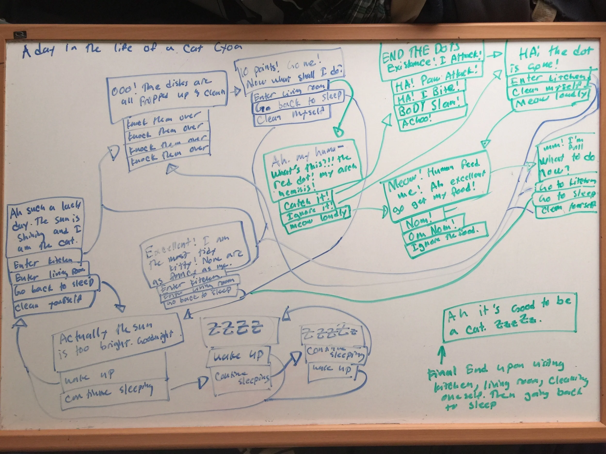
From here I began work on my whiteboard.

I would usually do a version of this in lucid chart ( https://www.lucidchart.com/ ) or Visio, but I no longer have the full version of lucid chart, and so it couldn’t handle all the parts needed. Here I sketched out a general idea as to what I could do and how all the pieces would fit together. I settled on three paths. The player would have to explore three different paths before going back to sleep and ending the cat’s day. Upon completing this, I began work on a word doc which would be easier to follow and be a little bit more legible.

That word file ended up looking like this:

G-rated 5-min cyoa – A day in the life of a Cat – paper prototype

Rules: Upon entering the living room, the kitchen and cleaning yourself, remove them from the options to travel to again.

1.     Ah! Such a lovely day! Being a cat is truly perfect!

a.     Enter the kitchen, Go to 2

i.     Already completed/visited? If yes. Then not available.

b.     Enter the Living room, Go to 4

i.     Already completed/visited? If yes. Then not available.

c.     Go Back to sleep, Go to 11

i.     If only remaining option, go to 14

d.     Clean myself, Go to 10

i.     Already completed/visited? If yes. Then not available.


2.     OOOO! DISHES! ALL PROPPED UP ON THE COUNTER FOR MEEE??!?

a.     Knock them down, Go to 3

b.     Make them fly, Go to 3

c.     Knock. Them. Down. , Go to 3

d.     KNOCK THEM DOWN!, Go to 3


3.     10 points! Go me! Now what shall I do?

a.     Enter living room, Go to 4

i.     Already completed/visited? If yes. Then not available.

b.     Go back to sleep, Go to 11

i.     If only remaining option go to 14

c.     Clean myself, Go to 10

i.     Already completed/visited? If yes. Then not available.


4.     Ah. My huma- WHAT’S THIS? RED DOT?!?!? YOU DARE SHOW YOUR FACE IN MY PRESENCE?!? HOW DARE YOU?!?

a.     I WILL CATCH YOU!, Go to 5

b.     You’re not worth my time, peasant, Go to 6

c.     Meow loudly, Go to 7


5.     HUZAAH! TODAY YOU SHALL MEET YOUR END, DOT! I ATTACK!

a.     HA! Feel the wrath of my paw attack!, Go to 6

b.     HA! You shall cower within my jaws! I BITE!, Go to 6

c.     KITTY USES BODY SLAM! , Go to 6

d.     Achoo! , Go to 6


6.     Running away again?! COWER YOU SLIME! If you ever so much as show your round redness here again it shall be your last mistake!

a.     Enter the Kitchen, Go to 2

i.     Already completed/visited? If yes. Then not available.

b.     Clean myself, Go to 10

i.     Already completed/visited? If yes. Then not available.

c.     MEOW! loudly, Go to 7


7.     MEEEEEEOW! Human feed me! Please I am but a hungry kitty! I require more nourishment for my adventures! Ah excellent! Retrieve my food. I shall stay put!

a.     NOM!, Go to 8

b.     OM NOM NOM! , Go to 8

c.     Eh, I’m no longer hungry, Go to 9


8.     Mmmmm! I’m full. Thank you, human servant. What do do now?

a.     Go to the kitchen, Go to 2

i.     Already completed/visited? If yes. Then not available.

b.     Go to sleep, Go to 11

i.     If only remaining option go to 14

c.     Clean yourself, Go to 10

i.     Already completed/visited? If yes. Then not available.


9.     Actually I am no longer hungry. You were too slow human servant. For your lack of speed, I shall sit upon your computer later! But for now, what to do?

a.     Enter the kitchen, Go to 2

i.     Already completed/visited? If yes. Then not available.

b.     Go back to sleep, Go to 11

i.     If only remaining option go to 14

c.     Clean myself, Go to 10

i.     Already completed/visited? If yes. Then not available.


10.  Excellent! I am the tidiest of kitties! None are as fancy or clean as I!

a.     Enter the kitchen, Go to 2

i.     Already completed/visited? If yes. Then not available.

b.     Enter the living room, Go to 4

i.     Already completed/visited? If yes. Then not available.

c.     Go back to sleep, Go to 10


11.  Actually, the sun is too bright Goodnight.

a.     Wake up, Go to 1

b.     Continue sleeping, Go to 12


12.  ZZzzZzZZZZzz

a.     Wake up, Go to 1

b.     Continue Sleeping, Go to 13


13.  ZZZZzzzZzzZzZZZzz zZZzzzz **Drool** ZzzZZZzZ

a.     Continue Sleeping, Go to 12        

b.     Wake up, Go to 1


14.  Ah! Today has been most eventful! Much has been completed and I am content. Good night human servant. Meow!

a.     The End.


Like I mentioned before, ideally I would have done this in lucid chart. A flow chart would be much easier to follow. Unfortunately, I didn’t have access to one, so I worked with what I had and made the best of it.

The next step was to take what I had and paper prototype it. This was easy enough. I took the above numbered text and printed it out, then cut them into strips. I did this because I did not want the players to see the next options. Had I just given them the paper, they might have glanced the other options and some of the story/comedy might be lost on them.

So I would give them the first piece, while hiding the others, and have them read their choices aloud. Upon reading out their choice, I would take the pieces of paper back from them and give them the chosen next one on their journey. I would also track if they have visited which of the three locations on a separate piece of paper. This paper was visible to the player though, so they wouldn’t make the choice which is no longer available. It was fun and I had excellent responses.

With the mock ups and paper prototype completed, and the prototype story written up, all that was left to do was the coding. So I got to work on that. The first version was less than pretty. I fell into a bit of a trap, as Xcode allows users to easily set up buttons through the storyboard file. Because of this, I was able to very rapidly create an incredibly rough version which functioned! However, it wasn’t quite what I was looking for. It lacked the ability to do multiple stories easily, and the checks to give the stories the variety I wanted them to have. Also, the way I set it up, it looked like a mess in storyboard.

Yeeeesh! Ugly!

Here’s a look at what that very rough early prototype looked like:

 Luckily, I had an old recipe app I had made a year or so ago lying around. So I used that instead as a jumping off point for the Choose Your Own Adventure platform I was building. In the short amount of time I had left, I was able to put together a better prototype. This prototype can be seen here:

Side note: Some of you may have noticed that the splash screen makes reference to Unreal Engine. That is because this is the splash screen we used for Haunted Hop. We are not owned by Epic nor are we affiliated with them. Though we do love their engine.

I’m running the app in the iPhone simulator supplied with Xcode. This way I can share with you what it looks like from launch until completion. As you can see in the beginning, I have created multiple spaces for multiple stories. I created a prototype cell to function as the main menu buttons. I used an XML to hold the story names, images and authors for each of the main menu options. I put each into their own Array, then all I had to do then was to figure out which cell was being displayed. This process was duplicated for each of the buttons on the main menu. Next, I passed the selected story name through a segue to the new view controller I have set up for the story pages. This set up allows me to have multiple stories stored, and use minimal amounts of view controllers. It will also eventually allow me to display the name of the story at the top if I so choose.

Ah! Now that’s better!

In the story page, I didn’t set up another XML to hold the info in. I didn’t think this was the best way to go when handling large amounts of story data. (Although in retrospect it might not be the worst idea either.) Very short on time, I just hard coded the story text, button options and story images in based on which page the player was on. This is not the best way to do it! In fact, this undermines my goal of getting multiple stories in. (Just a little bit.) It was just the fastest way for me to make sure I can get this prototype out on time.

Side Note: Towards the end of this post I’m going to go over some of the changes I’ll make after I put this blog post up.

A lot of these were the result:

// Page 2 info, Button text, story text, picture.

        if(pageNumber == 2){

            //Set the story text for page 2

            self.storyText.text = [NSString stringWithFormat:@"%@\n%@", @"OOOO! Dishes! All propped up", @"on the counter for meee?!?!"];


            //Set image for page 2

            self.storyImage.image = [UIImage imageNamed: @"Dishes.jpg"];


            //Set the button text for page 2

            [_button1Text setTitle:@"Knock them down." forState:UIControlStateNormal];

            [_button2Text setTitle:@"Make them fly." forState:UIControlStateNormal];

            [_button3Text setTitle:@"Knock. Them. Down." forState:UIControlStateNormal];

            [_button4Text setTitle:@"KNOCK THEM DOWN!" forState:UIControlStateNormal];

                            }


        //the player can no longer visit the kitchen

        kitchenVisted = true;

        return;

While it got the job done, it isn’t what I will be releasing with.  On the positive side, I got the checks in. Now when one of the routes are traveled, the button which leads to an already traveled path won’t appear. This can be seen in the end of the above video. Had the player traveled to the living room first, the button missing the text would have said “Enter the kitchen.”.

What do you want to change?

Just like I cleaned up the storyboard, I need to do some code clean up. I need to simplify it to make it more legible, so it won’t overwhelm anyone else reading it. Also, it will be easier to add additional stories. I need to make the buttons which don’t have any text always appear on the bottom of the four buttons. This will simply look better. I’d like to see about doing a few different transitions. And some sounds, maybe a couple particle effects. I can even change the text on each story/scene to better reflect the mood (Typography FTW!). Additionally, I’ll need to talk to a couple of my artist friends to see if and when they are available to begin art for the project. The main menu art definitely needs to be done so the text is legible.

The purpose of a prototype is to have a point to jump off of. Something that works, that you can use to show other people a functioning product. Something you can build on and refine. In that case, this project was hugely successful. I pulled it off with much less time than I thought I would have, and have used it to get a few of my friends excited for the project. Thus why I’m not releasing full source code. I will though, upon request, selectively release it. The biggest perk of getting people excited to work on a project is that they REALLY want to work on the project. So this will probably make it out the door in a few months as a release. If not, I may release the code then.

Thank you guys for sticking around. I hope you enjoyed my post and thought a little about your own process. The beautiful images used within my mock ups and prototype do not belong to me. I did not make them and take no credit for them. The recipe app I made a while back can be found in APPCODA’s book “Learn iOS Programming from Scratch” by Simon Ng. I highly recommend his book if you are looking into programming for iOS. I believe he has a newer version out for iOS 8 and 9. Next week we will be taking a look at Warhammer 40,000 Freeblade, an iOS game which controls like a dream.

I’ll see you guys next week,

Scott

Prototyping… I love it

Sorry it has been awhile. I started working on a new project in UE4 and have just been distracted by it.


I like to prototype. It helps me to figure out my thoughts and test the game mechanics to see if they are actually fun. Also I don’t have beautiful colors or great looking assets to cloud my judgment. It allows me to focus solely on the mechanics.  I know it has been written to death and back about but I feel it is really important for Game Designers to spend some time prototyping. And in their prototypes try different things to see what works and what doesn’t. In the following video I ran through and created a prototype for an infinite runner.

As you can see it doesn’t look amazing. I used assets, which were in the Unreal 4 starter pack this allowed me to focus on the fun. Because of this I learned more about my game which I would have never known otherwise. For example: The free run element is not working it makes it too hard when the player can free run across the field. If I were to do a full version I would lock the player to 3 different tracks (Or columns depending on how you want to think about it). Amongst the crazy things I tried one was the double jump. This you can see when I hit the particle field it gives the avatar a boost up. This was surprisingly rewarding because it looked intimidating when I was approaching it. This is a small sliver of all the things I learned from prototyping but I will continue using this practice because I feel I learn a lot from it.

There are millions of different reasons why I prototype but the main reason is to help me find the fun. Because if I don’t find the fun, then later on the team may have to crunch to try to change a chunk of the game because it isn’t fun.