iOS

Warhammer 40,000: Freeblade - Touching the Grim Dark Future

In the grim darkness of the far future, there is only war… and excellent touch controls. Freeblade is a lot of things, and I could gush about so many things it does right, but today I want to stick to the controls. Controls in iOS games typically fall into one of two categories: either they are intuitive and easy to use, or an absolute mess and frustrating.

Brief background:

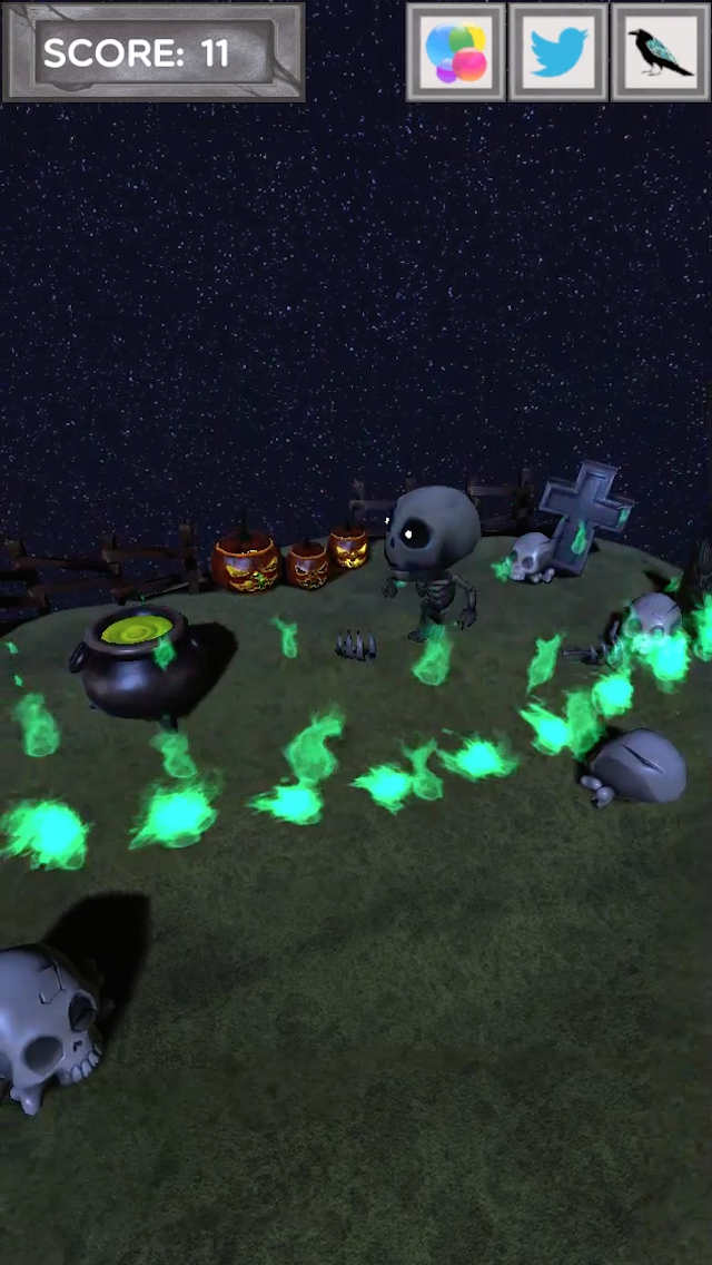
Freeblade, at its core, is a 3rd person rail shooter set in the Warhammer 40k universe. The player’s robot follows a track, stopping every so often to fight a small band of enemies. The fun is found via expertly dispatching these enemies, and being rewarded by cool explosions and combat animations. A later reward for completing the level consists of medals and materials to be used to improve the player’s robot.

A typical encounter would look like this:

Side note: Yes, I understand technically the robot/mech is an Imperial Knight. As someone who played the Warhammer 40k table top game for well over 15 years, I understand the difference between Dreadnaughts, Knights, Titans, and the like. But I say robot to simplify the term, to not confuse anyone who isn’t familiar with the franchise. So please don’t crucify me. With that said, the Eldar shall live on! Forever! Not even the pathetic forces of man or Chaos can stop us! Muahahaha…. **Cough** Excuse me. MOVING ON!

Let’s dissect the controls & some mechanics:

The player is given a small arsenal to eliminate their enemies. Our first weapon is the standard machine gun.

When a player taps and holds the screen with one finger, this aiming reticule appears slightly above the player’s finger. The player can then easily maneuver their finger to direct their robot’s rapid fire. After a time, (designated by the machine gun icon just below the x1 and the orange circle around the aiming reticle) the player’s machine gun will slow its fire due to being low on ammo. If the player decides to continue firing, the weapon will over heat and they will be unable to fire again until it fully recharges.

Side note: The way this is designed encourages players to attack in short controlled bursts, instead of just holding the machine gun fire button down the entire time. This also makes the weapon effective against groups of weak enemies instead of larger armored enemies.

Next up, let’s take a look at the heavy weapon.

When a player places two fingers close to one another on the screen, and then spreads them, the view zooms in and the heavy weapon aiming reticle is displayed. This time it appears where the player initially touched the screen with two fingers. When the player removes their fingers from the screen, the heavy weapon is fired wherever the aiming reticle is displayed. It can be moved slightly after it spawned, when the player moves both fingers in a certain direction. We can tell how much ammo the heavy weapon currently has via looking at the heavy weapon icon on the left side of the screen, directly below the machine gun icon. (Notice the three rounds next to the heavy weapon icon) We can also tell how much ammo is available by looking at the aiming reticle. There are three marks below it, currently designating the three rounds we have left. After the player runs out of ammo, they will have to wait for a short time for it to reload.

Side note: These weapons typically are good for taking out large enemies. They do high damage to a controlled small space. Using this weapon will only kill one or two enemies at a time and it fires slowly. Thus this encourages the player to use it on tanks rather than troops. One of my few dings on this game’s design shows up here as well. The aiming reticle is orange, which blends into the enemies’ colors and the brown of the world quite a bit. When I try to figure out what the designers were thinking, the idea of it being un-obstructive and not something they want the player to focus on comes to mind. But as you can see in the above image, they went through a lot of work to show how much ammo the player has left on the aiming reticle and it’s barely visible.

Let’s take a moment to talk about the shield:

Occasionally, an enemy with a heavy weapon of their own will show up, typically within a group of enemies. So they might not be the first enemy the player shoots because they might not notice them right off the bat. These enemies are designated by blue parenthesis with arrows at each edge. The arrows slide along the parenthesis until they collide. This is when the enemy will fire. If the player taps the enemy before the arrows collide, they will deploy a shield. This allows them to take less damage from incoming heavy attacks. This is particularly useful when there is a group of them and the player has run out of ammo so they are waiting for a recharge.

Side note: I like this mechanic because, while not as exciting as combat, it continues to engage players and forces the players to do something different. So even if the player is shooting at another enemy, they may have to stop for a second to put up their shield to avoid the heavy damage from these guys. Because this also forces players to stop shooting for a second, it allows their weapons to recharge. Thus engaging them and not making them feel that they are only waiting for a weapon recharge.

And finally, my favorite close combat!

First the player must choose to engage in close combat.

This is designated via a red fist icon and some red parenthesis. What I like about this particular scenario is that I have a choice. Go into close combat and get an awesome combat cinematic, or Indiana Jones this poor guy and just shoot quickly with the big guns. For the sake of this post, and because we’ve already gone over the big guns, we’re not going to just shoot it. So, let’s say the player taps within the red parenthesis to engage in close combat.

Side note: If the player doesn’t tap within the red parenthesis or kill the enemy quickly enough, the enemy will get a free close combat attack on them. So doing the Indiana Jones thing of just shooting them has its own risks.

A bar will appear in the bottom half of the screen and the player must tap the screen when the two white fist bars are within the green areas. If you have played Gears of War, think of the active reload system. If not, the white bars start on the edges of the “Hit!” bar. They travel inward simultaneously. The player has an area in which they can activate the attack to do normal damage (transparent green bar), and an area to do critical damage (filled in green bar in the dead center).

While the white bars are traveling inward, the two robots are chagrining each other.

If the player taps before white bars enter the green spaces, they will take a hit.

Ouch! Same goes for waiting too long and not tapping before the bars have passed one another.

Fortunately, it is incredibly rewarding to get a critical.

Oh yeah. Chainsaw sword.

This combat mechanic is simple. Due to the nature of touch devices though, it makes it feel good. This system allows for the combatants to get really close and fight. And the player is rewarded with a really cool animation if they win, or an even better one if they get a critical hit. A different system might not result in these amazing visual combat scenes due to how crazy the visuals of each combatant look. Don’t believe me? Look at the previous images without the combat bar. Sometimes it is tough to tell where one robot starts and one ends.

Side note: This particular reward of getting to see these robot fights is probably the biggest reason I don’t just shoot enemies as they are charging me. Although sometimes I will to try and soften them up before we engage in combat.

So back to controls.

We see a few themes in this game which are known across other excellent iOS games. The biggest point being the usage of touch gestures which are already commonly used in touch applications. To elaborate, separate fingers to zoom in and tapping on the screen with a player’s index finger are all examples of gestures we do every day just to surf the web with our smart devices. So players have been already exposed to all these gestures and they are easy to learn in game.

Wait a second you dinged another game for having buttons which the player must tap on but in this game, you are praising it for having enemies which the player must tap on as well.

Valid point. Let me explain. The games I dinged have buttons on the bottom of the screen. The buttons are away from the action and are not the player’s focus. Because of this it is easy for players to not notice when their thumb moves out of position slightly. Buttons work great for computers and consoles because players can use their sense of touch to tell exactly where the buttons are. On a touch screen however, players cannot. In Freeblade, when the player needs to tap a space (for example to put up a shield), where they need to tap is highlighted on screen and a part of the action. This means the player wont miss it. I guess an easy rule of thumb to follow would be this: Think about how we hold our devices. Think about what finger players will be using to tap this item. If it is their thumb, then there is a good chance it isn’t the focus of the screen and it might be a good idea to rethink it’s positioning. If they are probably going to tap it with an index finger, then it is probably safe.

Let me give you some visual examples:

This is Adventures of a Round Object. It’s a platformer where the player controls a ball in an attempt to make it to the end of a level. It’s also the first game I ever released about six years ago. Now think about holding your phone in landscape and trying to touch these buttons. It’s not tough to reach them, but it will be difficult to get the button precision required to platform effectively. This is because the player’s focus is not on the buttons, but instead on their ball trying to make its way through the level. In moments where a small misstep means life or death, those buttons need to be in focus.

Side Note: If I were to recreate this game, I might do something like: right side of the screen = move right, left side of the screen = move left, and center part of the screen = jump so I could get away with not having any buttons. This would allow the player to not have to focus on buttons because the area is so large, it is nearly impossible to miss.

Now in Freeblade, because the enemy location is different every time, the player will focus more on the location they need to tap. Due to that required focus players always look where they are tapping thus resulting in them not missing the mark.

I hope I inspired you to think more about how players are controlling iOS games. I know I am thinking about it even more now. All these screen shots were taken by me from Warhammer 40,000: Freeblade for iOS. Adventures of a Round Object used to be available on iOS, but I recently pulled it due to some poor marketing choices I made years ago. If you are interested in playing it, feel free to ask and I can send you a code to download it for iOS. Next week I will be doing a post mortem for an App I worked on not too long ago, NFL RUSH Zone: Heroes and Rivals. We’ll talk about what went well, what I think went poorly and maybe a little bit of the design behind it. Maybe if I’m lucky I can convince some of the other designers who worked on it to chime in as well.

I’ll see you guys next week,

Scott  

If you enjoyed this post, you’ll enjoy Signposted my game design focused newsletter. You can sign up here: https://signposted.beehiiv.com/subscribe

Choose Your Own Adventure Prototype

So remember how last week I mentioned I was going to make a prototype? Well…. I did it! This week I’m going to walk you through a bit of my process. This is in no way how you should necessarily do things; this is just to show how I do things.

But first, what and why?

To be honest, it was kind of a combination of a few things happening around the same time.

First off, I spend a lot of time at Disneyland. And while games like Heads Up are excellent for groups, I wanted to make something people could play alone. I know this might sound stupid because most apps engage only a single player anyways, but bear with me. I wanted to make something which didn’t demand the player’s constant engagement, so they can look up and move in line if they have to. Something they could take at their own pace.

Secondly, in a lot of the apps I have created on my own, I haven’t been able to convey emotion to players easily due to the lack of story. So I really wanted to try something where I cold tell stories, and maybe convey emotion better. Due to the short play sessions of mobile, I wanted to make a game which can be played in short bursts of 5 minutes or less.  Thus the idea of a choose your own adventure app, which the player could finish a story in less than 5 minutes, was born. The next step was to figure out what to prototype it with.

Not long after this, a few friends and I were watching the Rob Cantor Shia LaBeouf video. And I had this crazy thought, what if this was a choose your own adventure? That could be a lot of fun! So I sketched out a few ideas and began to try to figure out how it would work. Unfortunately, I wasn’t able to hold onto the comedic aspect which was portrayed in Mr. Cantor’s video. That, and it became overly complicated, essentially going over the 5-minute play session I wanted to go with. So, I had to scrap that idea and start out fresh.

Side note: It probably helps that I grew up with choose your own adventure books. And I love them. The Goosebumps ones were my particular favorite. Though I would always cheat and look ahead to make sure I wasn't going to have to start over.

The process:

With a rough idea as to what I wanted to do, I began to mock up some designs. What would each page look like? How would the player interact with each page? What fun little things could we do to further immerse the player in the stories? What if we did more than one story?

Since I keep hearing everyone talk about creating a platform which can grown instead of singular games, I figured I’d try to do the same.

After a few iterations, I settled on this wireframe as the idea I wanted to run with.


On the left side we can see the settled on Main menu. From here, players can choose the story they wish to play. Or they can visit the store and purchase story packs.  We also see a shop button, which would allow players to purchase additional stories.

Side note: I can’t stress enough how important it is to think about how you are going to monetize your app while designing it. I settled on selling five stories in each pack. Each pack would be a dollar.

On the right hand side, we can see the story screen. This is a rough wireframe of what each story page will look like.

·      A button for the menu allows players to return to the main menu at any time.

·      Story text – some flavor text which would progress the story and provoke the player to make a choice.

·      Picture – a pretty picture to help give the player more of an idea as to what is going on.

·      Option A-D – Spaces for 4 different options. Here the player would tap to make their decision. Upon tapping an option, they would be taken to the next page.

To get a better idea of what the final version might look like I created this mock up:

Side note: I used to have page numbers at the top of the story screens. However, after consulting a friend of mine, I decided against having them because, aside from them not looking so great, we wanted the player to not know how far they have progressed in the story. We figured that if the story was under 5 minutes, they wouldn’t be getting frustrated from not knowing. That, and when I finally began to write the prototype story, through certain actions I gave the player the ability to move backwards in the story. This created less of a linear experience and guaranteed everyone would have a different story.

With the design of the page figured out, I moved on to create the prototype story. Now, I don’t know about anyone else, but when I create a prototype story I prefer to have something that makes me laugh. Or at the very least smile. Like I mentioned before, the increasingly violent version of Cannibal Shia LaBeouf was not working for me. So I had to change the story. I settled on a day in the life of a cat. Simple. Fun. Not too crazy.

From here I began work on my whiteboard.

I would usually do a version of this in lucid chart ( https://www.lucidchart.com/ ) or Visio, but I no longer have the full version of lucid chart, and so it couldn’t handle all the parts needed. Here I sketched out a general idea as to what I could do and how all the pieces would fit together. I settled on three paths. The player would have to explore three different paths before going back to sleep and ending the cat’s day. Upon completing this, I began work on a word doc which would be easier to follow and be a little bit more legible.

That word file ended up looking like this:

G-rated 5-min cyoa – A day in the life of a Cat – paper prototype

Rules: Upon entering the living room, the kitchen and cleaning yourself, remove them from the options to travel to again.

1.     Ah! Such a lovely day! Being a cat is truly perfect!

a.     Enter the kitchen, Go to 2

i.     Already completed/visited? If yes. Then not available.

b.     Enter the Living room, Go to 4

i.     Already completed/visited? If yes. Then not available.

c.     Go Back to sleep, Go to 11

i.     If only remaining option, go to 14

d.     Clean myself, Go to 10

i.     Already completed/visited? If yes. Then not available.


2.     OOOO! DISHES! ALL PROPPED UP ON THE COUNTER FOR MEEE??!?

a.     Knock them down, Go to 3

b.     Make them fly, Go to 3

c.     Knock. Them. Down. , Go to 3

d.     KNOCK THEM DOWN!, Go to 3


3.     10 points! Go me! Now what shall I do?

a.     Enter living room, Go to 4

i.     Already completed/visited? If yes. Then not available.

b.     Go back to sleep, Go to 11

i.     If only remaining option go to 14

c.     Clean myself, Go to 10

i.     Already completed/visited? If yes. Then not available.


4.     Ah. My huma- WHAT’S THIS? RED DOT?!?!? YOU DARE SHOW YOUR FACE IN MY PRESENCE?!? HOW DARE YOU?!?

a.     I WILL CATCH YOU!, Go to 5

b.     You’re not worth my time, peasant, Go to 6

c.     Meow loudly, Go to 7


5.     HUZAAH! TODAY YOU SHALL MEET YOUR END, DOT! I ATTACK!

a.     HA! Feel the wrath of my paw attack!, Go to 6

b.     HA! You shall cower within my jaws! I BITE!, Go to 6

c.     KITTY USES BODY SLAM! , Go to 6

d.     Achoo! , Go to 6


6.     Running away again?! COWER YOU SLIME! If you ever so much as show your round redness here again it shall be your last mistake!

a.     Enter the Kitchen, Go to 2

i.     Already completed/visited? If yes. Then not available.

b.     Clean myself, Go to 10

i.     Already completed/visited? If yes. Then not available.

c.     MEOW! loudly, Go to 7


7.     MEEEEEEOW! Human feed me! Please I am but a hungry kitty! I require more nourishment for my adventures! Ah excellent! Retrieve my food. I shall stay put!

a.     NOM!, Go to 8

b.     OM NOM NOM! , Go to 8

c.     Eh, I’m no longer hungry, Go to 9


8.     Mmmmm! I’m full. Thank you, human servant. What do do now?

a.     Go to the kitchen, Go to 2

i.     Already completed/visited? If yes. Then not available.

b.     Go to sleep, Go to 11

i.     If only remaining option go to 14

c.     Clean yourself, Go to 10

i.     Already completed/visited? If yes. Then not available.


9.     Actually I am no longer hungry. You were too slow human servant. For your lack of speed, I shall sit upon your computer later! But for now, what to do?

a.     Enter the kitchen, Go to 2

i.     Already completed/visited? If yes. Then not available.

b.     Go back to sleep, Go to 11

i.     If only remaining option go to 14

c.     Clean myself, Go to 10

i.     Already completed/visited? If yes. Then not available.


10.  Excellent! I am the tidiest of kitties! None are as fancy or clean as I!

a.     Enter the kitchen, Go to 2

i.     Already completed/visited? If yes. Then not available.

b.     Enter the living room, Go to 4

i.     Already completed/visited? If yes. Then not available.

c.     Go back to sleep, Go to 10


11.  Actually, the sun is too bright Goodnight.

a.     Wake up, Go to 1

b.     Continue sleeping, Go to 12


12.  ZZzzZzZZZZzz

a.     Wake up, Go to 1

b.     Continue Sleeping, Go to 13


13.  ZZZZzzzZzzZzZZZzz zZZzzzz **Drool** ZzzZZZzZ

a.     Continue Sleeping, Go to 12        

b.     Wake up, Go to 1


14.  Ah! Today has been most eventful! Much has been completed and I am content. Good night human servant. Meow!

a.     The End.


Like I mentioned before, ideally I would have done this in lucid chart. A flow chart would be much easier to follow. Unfortunately, I didn’t have access to one, so I worked with what I had and made the best of it.

The next step was to take what I had and paper prototype it. This was easy enough. I took the above numbered text and printed it out, then cut them into strips. I did this because I did not want the players to see the next options. Had I just given them the paper, they might have glanced the other options and some of the story/comedy might be lost on them.

So I would give them the first piece, while hiding the others, and have them read their choices aloud. Upon reading out their choice, I would take the pieces of paper back from them and give them the chosen next one on their journey. I would also track if they have visited which of the three locations on a separate piece of paper. This paper was visible to the player though, so they wouldn’t make the choice which is no longer available. It was fun and I had excellent responses.

With the mock ups and paper prototype completed, and the prototype story written up, all that was left to do was the coding. So I got to work on that. The first version was less than pretty. I fell into a bit of a trap, as Xcode allows users to easily set up buttons through the storyboard file. Because of this, I was able to very rapidly create an incredibly rough version which functioned! However, it wasn’t quite what I was looking for. It lacked the ability to do multiple stories easily, and the checks to give the stories the variety I wanted them to have. Also, the way I set it up, it looked like a mess in storyboard.

Yeeeesh! Ugly!

Here’s a look at what that very rough early prototype looked like:

 Luckily, I had an old recipe app I had made a year or so ago lying around. So I used that instead as a jumping off point for the Choose Your Own Adventure platform I was building. In the short amount of time I had left, I was able to put together a better prototype. This prototype can be seen here:

Side note: Some of you may have noticed that the splash screen makes reference to Unreal Engine. That is because this is the splash screen we used for Haunted Hop. We are not owned by Epic nor are we affiliated with them. Though we do love their engine.

I’m running the app in the iPhone simulator supplied with Xcode. This way I can share with you what it looks like from launch until completion. As you can see in the beginning, I have created multiple spaces for multiple stories. I created a prototype cell to function as the main menu buttons. I used an XML to hold the story names, images and authors for each of the main menu options. I put each into their own Array, then all I had to do then was to figure out which cell was being displayed. This process was duplicated for each of the buttons on the main menu. Next, I passed the selected story name through a segue to the new view controller I have set up for the story pages. This set up allows me to have multiple stories stored, and use minimal amounts of view controllers. It will also eventually allow me to display the name of the story at the top if I so choose.

Ah! Now that’s better!

In the story page, I didn’t set up another XML to hold the info in. I didn’t think this was the best way to go when handling large amounts of story data. (Although in retrospect it might not be the worst idea either.) Very short on time, I just hard coded the story text, button options and story images in based on which page the player was on. This is not the best way to do it! In fact, this undermines my goal of getting multiple stories in. (Just a little bit.) It was just the fastest way for me to make sure I can get this prototype out on time.

Side Note: Towards the end of this post I’m going to go over some of the changes I’ll make after I put this blog post up.

A lot of these were the result:

// Page 2 info, Button text, story text, picture.

        if(pageNumber == 2){

            //Set the story text for page 2

            self.storyText.text = [NSString stringWithFormat:@"%@\n%@", @"OOOO! Dishes! All propped up", @"on the counter for meee?!?!"];


            //Set image for page 2

            self.storyImage.image = [UIImage imageNamed: @"Dishes.jpg"];


            //Set the button text for page 2

            [_button1Text setTitle:@"Knock them down." forState:UIControlStateNormal];

            [_button2Text setTitle:@"Make them fly." forState:UIControlStateNormal];

            [_button3Text setTitle:@"Knock. Them. Down." forState:UIControlStateNormal];

            [_button4Text setTitle:@"KNOCK THEM DOWN!" forState:UIControlStateNormal];

                            }


        //the player can no longer visit the kitchen

        kitchenVisted = true;

        return;

While it got the job done, it isn’t what I will be releasing with.  On the positive side, I got the checks in. Now when one of the routes are traveled, the button which leads to an already traveled path won’t appear. This can be seen in the end of the above video. Had the player traveled to the living room first, the button missing the text would have said “Enter the kitchen.”.

What do you want to change?

Just like I cleaned up the storyboard, I need to do some code clean up. I need to simplify it to make it more legible, so it won’t overwhelm anyone else reading it. Also, it will be easier to add additional stories. I need to make the buttons which don’t have any text always appear on the bottom of the four buttons. This will simply look better. I’d like to see about doing a few different transitions. And some sounds, maybe a couple particle effects. I can even change the text on each story/scene to better reflect the mood (Typography FTW!). Additionally, I’ll need to talk to a couple of my artist friends to see if and when they are available to begin art for the project. The main menu art definitely needs to be done so the text is legible.

The purpose of a prototype is to have a point to jump off of. Something that works, that you can use to show other people a functioning product. Something you can build on and refine. In that case, this project was hugely successful. I pulled it off with much less time than I thought I would have, and have used it to get a few of my friends excited for the project. Thus why I’m not releasing full source code. I will though, upon request, selectively release it. The biggest perk of getting people excited to work on a project is that they REALLY want to work on the project. So this will probably make it out the door in a few months as a release. If not, I may release the code then.

Thank you guys for sticking around. I hope you enjoyed my post and thought a little about your own process. The beautiful images used within my mock ups and prototype do not belong to me. I did not make them and take no credit for them. The recipe app I made a while back can be found in APPCODA’s book “Learn iOS Programming from Scratch” by Simon Ng. I highly recommend his book if you are looking into programming for iOS. I believe he has a newer version out for iOS 8 and 9. Next week we will be taking a look at Warhammer 40,000 Freeblade, an iOS game which controls like a dream.

I’ll see you guys next week,

Scott

Two Dots, Too Charming.

Two Dots is an excellent mobile game, from the easily understood gameplay, to the sights and sounds within the game. My goal for this post is to break the game down. What are the core mechanics? How do they use the free to play model? What makes it so charming? What can we learn from this game?

How it works:

·      Basics: Players connect two or more dots of the same color to remove them from the board (Vertical/horizontal only)

o   Typically 4 colors

·      Squares: If players create a box (Connect 4 squares and close the connection) it removes all of the same colored dots from the board

·      Bombs: If players create a larger box, with other color dots inside the box, all of the dots which share the same colors as the connected dots are removed from the board. Any dots inside the box will destroy other dots around them after the connected colored dots are removed.

Every level is based on these mechanics. The beauty of this is they found additional ways to play with these. In each world a new challenge is introduced. In world 1 the players simply need to connect a certain amount of each colored dot. In world 2 we are introduced to anchors, something I’ve seen in match 3s like Frozen Freefall, in which players must get specific “Anchor” dots to the bottom of the board to eliminate them. This keeps the gameplay feeling fresh and interesting. Then, right before the player is bored of the anchor feature, they change it up. In world 3 they introduce the “Ice”. Here, players will have to connect dots behind the ice plates to do damage to them. Three connections behind each ice pane will cause them to shatter. The player will have to clear the board of ice panes to beat these levels. Like I mentioned, every world introduces something new to challenge the player.

The free to play:

We see the common five lives restriction in Two Dots. (A life recharges every 20 minutes or, for 99 cents, the player can recharge them immediately.) There is the Facebook connection, which shows the player where their friends are and what they scored before and after they finish a level. But the two fresh ideas I want to focus on are their take on daily rewards and giving the player an upsell for a power up before the level starts.

Daily rewards:

From my experience, I’ve seen two types of daily rewards fairly commonly. First there is the gem rewards, like in Angry Birds 2, where everyday the player plays they are given a miniscule amount of gems. These add up over time, but players can’t do anything with them for a long time because everything is so expensive. (In Angry Birds 2 this was two or three gems. This didn’t help much when a continue or a power up would cost 60 gems or so.) So I never ended up getting any enjoyment from the gems they gave me. I stopped playing long before I saved up enough.

The other style of daily rewards are the building rewards. (We used this frequently at JumpStart.) A player would gain a reward when they entered the game for the first time that day, and if they entered the game on the following day they would get an even better reward. (This stacked for a week and then would reset.) The idea here is to get the player to return day after day to get better and better rewards. Typically, these were rewards like “20 Gold” or some minor item, which wouldn’t be immediately useful to the player. They would still have to save up the gold or spend real money to get enough to buy something useful. Some of the later rewards were more useful but only in specific situations.

Side note: School of Dragons has always grown at an alarming rate. As such, the talented developers have caught this issue and seem to have adjusted it since. The items now are much more useful to most players, but they still have the issue of not always being useful to all players. This is because the game is so large. It is impossible to predict what everyone would want. The only things useful across the board are gems and gold. But they cannot give out too many of those or they risk breaking the economy. I use School of Dragons only as an example of a different style of daily rewards, the building style. In a smaller game, like Two Dots, this style would be easier to balance and give out rewards everyone would use.

Two Dots gives the player a random power up. Whether that’s extra lives or a boost, the daily reward is always immediately useful. This almost always pushes me to use it. Also I’m more liberal in my use of boosts because I know there is a good chance I will be getting more. So what’s hurting Angry Birds and School of Dragons? The saving up. While logically this seems like it would continue to engage players over a longer period of time because they are saving for something, we live in a world where no one (aside from the wise or elderly) saves. Especially in mobile games. Everything is about instant gratification. (And less than 10-minute play sessions) So while players need to learn to save, they will enjoy the game more if they get that instant usable reward.

Power Up Upsell:

Last week we talked about Angry Birds 2 and the issue players are having with upsells, the primary issue being with the gameplay itself. Two Dots does an excellent job of upselling power ups to players but doesn’t change a whole lot from Angry Bird’s upsell system. The one big difference is where the upsell with a video ad appears. In Angry Birds 2, these video upsells appeared only after the player lost or in the daily reward for a double reward. In Two Dots, it still has the daily reward video ad upsell, but they moved the location of the second video ad upsell. They have it attached to the pre-game screen. When a player watches it, they get a free boost power up. And you know what? I watch it every chance I get. I actually look forward to them. I think why I look forward to it so much (where as I just skip the Angry Birds post failure upsell ad videos) is because I know it will help. I know I will start off stronger and have a better chance to win because of it. Where as in Angry Birds 2, (Since it only pays out one random bird, unfortunately, after I’ve lost) it only feels helpful in very specific situations. And even then it has to give the the bird I need. (Due to the randomness, it doesn’t usually happen)

Side note: So how can Angry Birds 2 learn from this? Add a video upsell for the power ups in the beginning, then they can pay out the player a random power up to use in the level they are about to play. I guarantee this will have almost everyone watching their upsell video ads every chance they get.

The Challenge & Charm:

Two Dots holds the challenge of a basic match 3 game, where players will have to see how removing specific dots will effect the rest of the board. Due to removing the timer, the player has a much more zen experience. This allows players to have the time to really look around and try to figure out the best move.

Let’s take a look at how these puzzles work:

Here we have two anchors which we need to drop out of the bottom of the level. So I ask you, “What is your gut reaction?”


By just glancing at this you might think eliminating the most dots below the anchors as quickly as you can might be the best option, but it’s not. If we do this, it will increase the level’s difficulty, and ruin our chances of beating it. Instead let’s change our thinking.


If we examine our situation, we can see that ideally we need to get these two greens next to each other. This way we can eliminate them both and clear the anchor on the left while lowering the right anchor as well. We need to lower the right green dot by two.


Luckily, if we remove these two purple dots, we can get our greens lined up and win the level. This works out perfectly because if we are thinking a couple moves ahead, we can see the purple above the right green and the purple below the two we will be removing, will line up.


Now our greens are lined up.


While tempting, the player must remember that they are playing the long game. And as such, they should avoid removing these two purples at this moment because it will ruin our chances at beating the level. Remember, it isn’t about moving your anchor to the bottom as quickly as possible, because there is no timer. It is about doing it in the least amount of moves possible.


Our true goal, to ensure our victory, is getting these purples and blues together.


Due to our previous moves, the left green is surrounded by blues, which we can connect upon removing the greens to drop that anchor. The right green is surrounded by purples which we can do the same with to drop the right anchor. Upon doing so, we have ensured our victory of this level.


All we need to do at this point is connect the blues and the purples to drop our last two anchors.


Sweet victory is ours!


I really enjoy this style of thinking ahead. This creates layers of gameplay which makes each level fun and challenging. And with each world’s mechanical twist, strategizing and thinking ahead becomes a necessity. Also, while in Angry Birds 2 it was nearly impossible to think ahead and strategize, here we can see it is very possible. You might ask, “Don’t they both have random levels?” Ah! Not quite! Here are two screen shots from the exact same level played one right after the other. (I started one up, lost, then restarted the level)

We can see some dots are changed. But some stay consistent! The player is able to have a similar opening move every time. And because they will never run out of moves with a certain color, they aren’t forced to hold back, thus the randomness is not as frustrating. Additionally, this style of gameplay gives the player enough variety to make them believe that if they lost they might have been able to do something different. Perhaps they missed something. That thought is incredibly important because it helps players to not feel shoehorned into purchasing what they are upsold if they want to win.

The charm comes from everything else in the game. The world theming matching the mechanics for one:

Anchor mechanic in level? Boom! Ocean World.

Ice mechanic in level? Boom! Mountain peak world.

This extends across the music and the menu animations as well. I think the best way to get the feeling across is this image:

When a player reaches a new world, they are prompted to share their status on social media. This is the image it posts. “Join me in the ocean depths! Playtwo.do/ts #TwoDots” is the text that posts with it. It doesn’t feel overbearing or “HEY! WATER MY CROPS!!” “Join me in the ocean depths!” It’s different. It’s not in your face demanding your attention. In fact, It’s subtle, with a beautiful piece of art. Something I might actually want to share. This actually draws my attention on it’s own. It makes it sound like a friend is merely suggesting that we should go on an adventure together.

In order to have an enjoyable puzzle game, players need to have all the pieces available to them. Without all the pieces, they just get frustrated and rightfully so. Last week, we looked into Angry Birds 2, and comparing it to this week’s look at Two Dots, we can see how one arguably is a better puzzle game than the other. This is simply achieved by withholding minimal amounts of data (what dots will fall down next) from the player, thus they get less frustrated.

I have learned a lot via comparing these two games, and I hope you have as well. Next week we will be looking into Rayman Fiesta Run. Being a fan of the Rayman Legends music levels, I’m pretty excited. Thank you for sticking around through the entire post.

I’ll see you guys next week

Scott

If you like my work and want to support my caffeine addiction, please consider donating to my Ko-Fi.

Blog: Diamond Raven Games & Haunted Hop not quite a post mortem

Sorry again for another blog I haven't had as much time to analyze games as I would have liked recently (Though I'm going to be looking into Assassin's Creed: Black Flag soon). So update time!

As many of you may already know, after I got laid off I started a venture with one Ms. Josie Noronha. This we called Diamond Raven Games. We wanted to make some simple app that looks gorgeous for the iPhone. Something that would control well and was still enjoyable. Initially we wanted to do a dungeon crawler. We thought this was a brilliant idea. Because UE4 lends its self very well to level editing. Fortunately, within the first week, we realized this was a little out of scope for us. So we scaled back. Our next plan was doing a simple match-3. We figured this was more manageable. But we quickly realized a few hundred levels in our couple month time limit wasn't going to work very well on such a small team with an engine which neither of us have used in over a year. At least they wouldn't be possible at the level of quality and polish we wanted to release with. So we scaled back further. Then in April I threw together a quick prototype of a man jumping rope in UE4. It used a single input as the control (Just the space bar to jump) and kept score based on how many times players were able to jump without touching the rope. Simple enough we figured this might be a good starting point. Here is a video of said prototype/Proof of concept:

Knowing that simple games typically do fairly well on iOS we decided to press forward with this.

We ran into a considerable amount of speed bumps along the way. For one, while Josie could 3D model and animate she couldn't do it fast enough to meet our deadline. And while I could do some 3D modeling, animating was beyond my wheelhouse. So we decided to see what was available in the Unreal Store. We managed to snag the 3d character, graveyard parts, fire particles and sounds from the store. This was a lifesaver. Mostly because we thought about doing the game in 2D so Josie could do all the art without a problem. But we felt that it wouldn't look as cool as a 3D game and the camera angle would be weird. So we continued on.

A particular design challenge I ran into was: I wanted there to be 7 different speeds for the fire to move at. And each speed would be a different color. In concept this sounded good. But it turned out to make the game much more complicated and created a game design crippling bug. (Each speed needed to have it's own corresponding color the bug was letting any speed have any color so the player couldn't learn the feel of the speeds.) Because of the bug, and that it made the game possibly too complicated, we scaled back down to 3 speeds. Red (Slow), Yellow/Orange (Normal), Green (Fast). (Just like traffic lights BOOM GAME DESIGN! sorry I couldn't help myself...)

We continued on through many different bugs and issues which would make any non crazy individual pull their hair our (The legendary fire particle bug, the reset but in an alternate dimension bug, and the hidden sky just to name a few). I'll go more into those in our actual post-mortem. But we've finally come to the point where we are getting to release the game. 4 long months later. It definitely looks great. It's simple using only single input. And it is fun. At least in a similar way to Flappy Bird being fun.

I thank you for sticking around for the entire post and if you have an iOS device please download it and let me know what you think. I hope you enjoy the game and continue to support us in the feature.

Thank you,

Scott